■ Design Concept
– Minimal Luxury
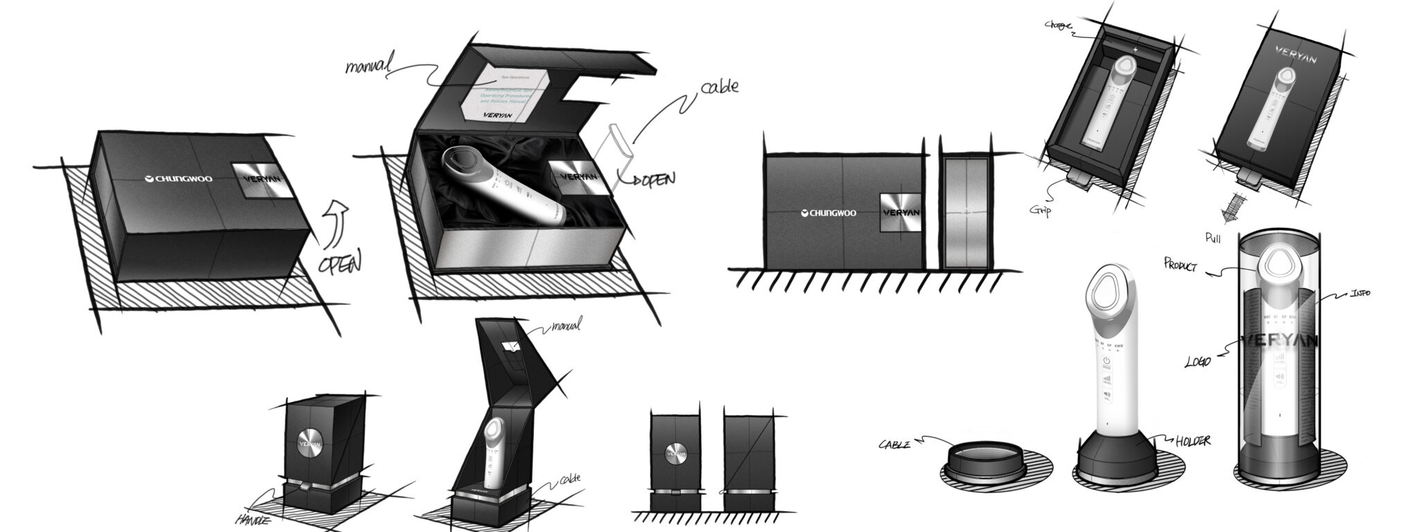
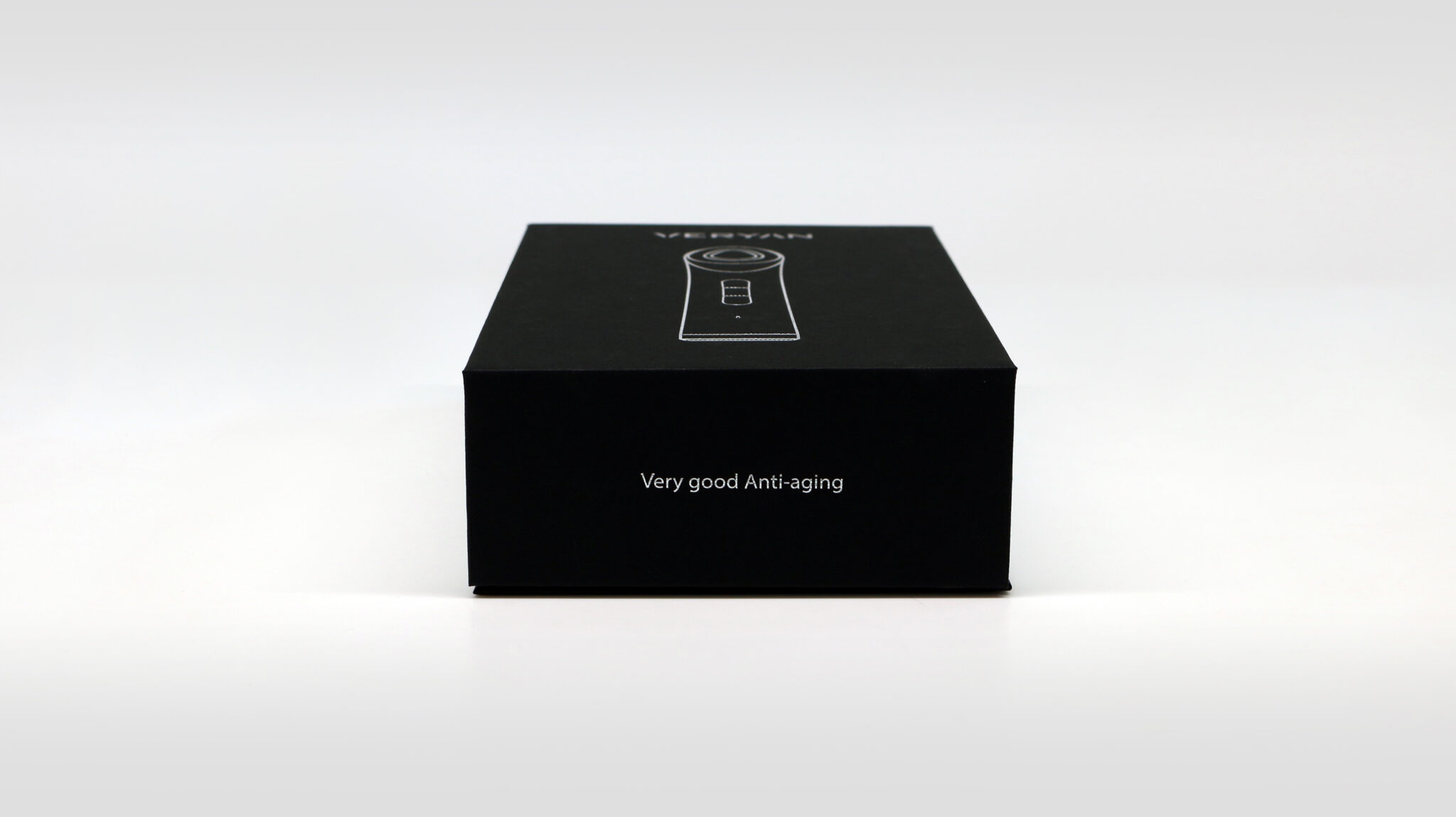
This package design for the anti-aging device VERYIN features an extremely restrained minimal design strategy to maximize the professionalism and reliability of the product. By removing unnecessary graphic elements and minimizing the density of color, form, and information, it visually communicates brand confidence and certainty in product efficacy. The exterior package is based on a matte black color, providing a luxurious and stable first impression. On the top, a white line drawing graphic simplifying the product silhouette allows users to intuitively recognize the product identity without excessive image exposure. This is a premium strategy that gives consumers the impression of a product that is understood without being explained.
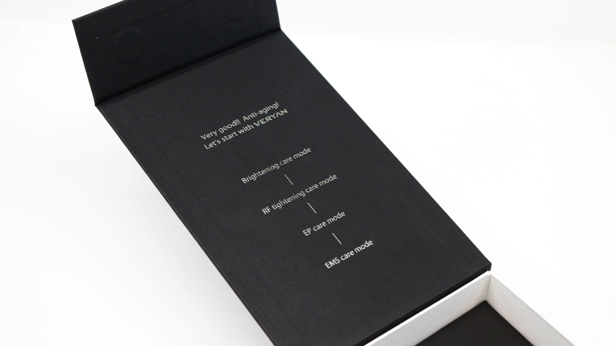
The phrase Very good Anti-aging on the side communicates the core value of the product in a neat and simple tone rather than through emotional marketing copy. This restrained sentence builds a level of trust similar to products used in medical and professional fields, accurately positioning it between a home beauty device and a medical device.
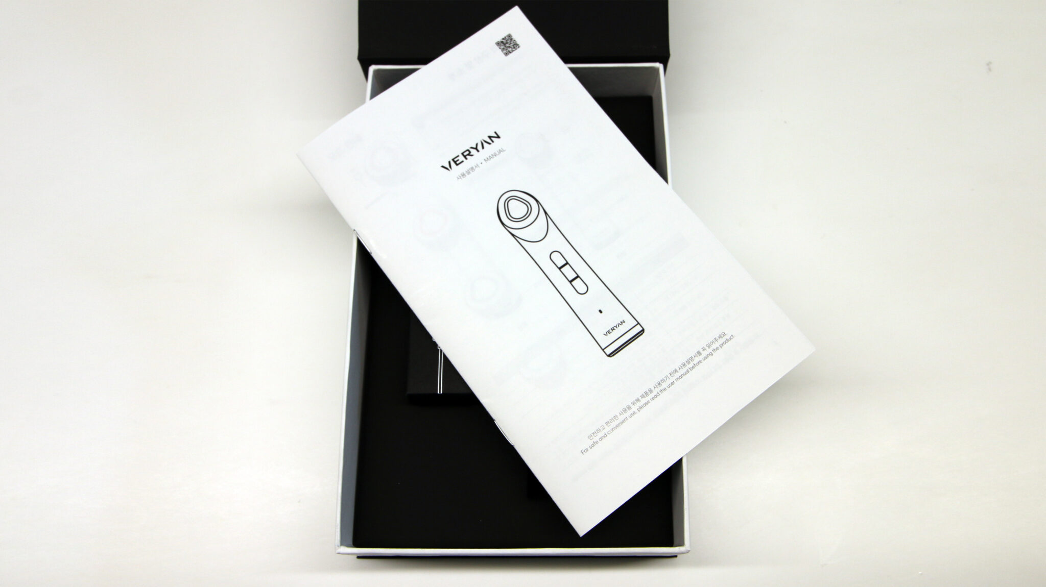
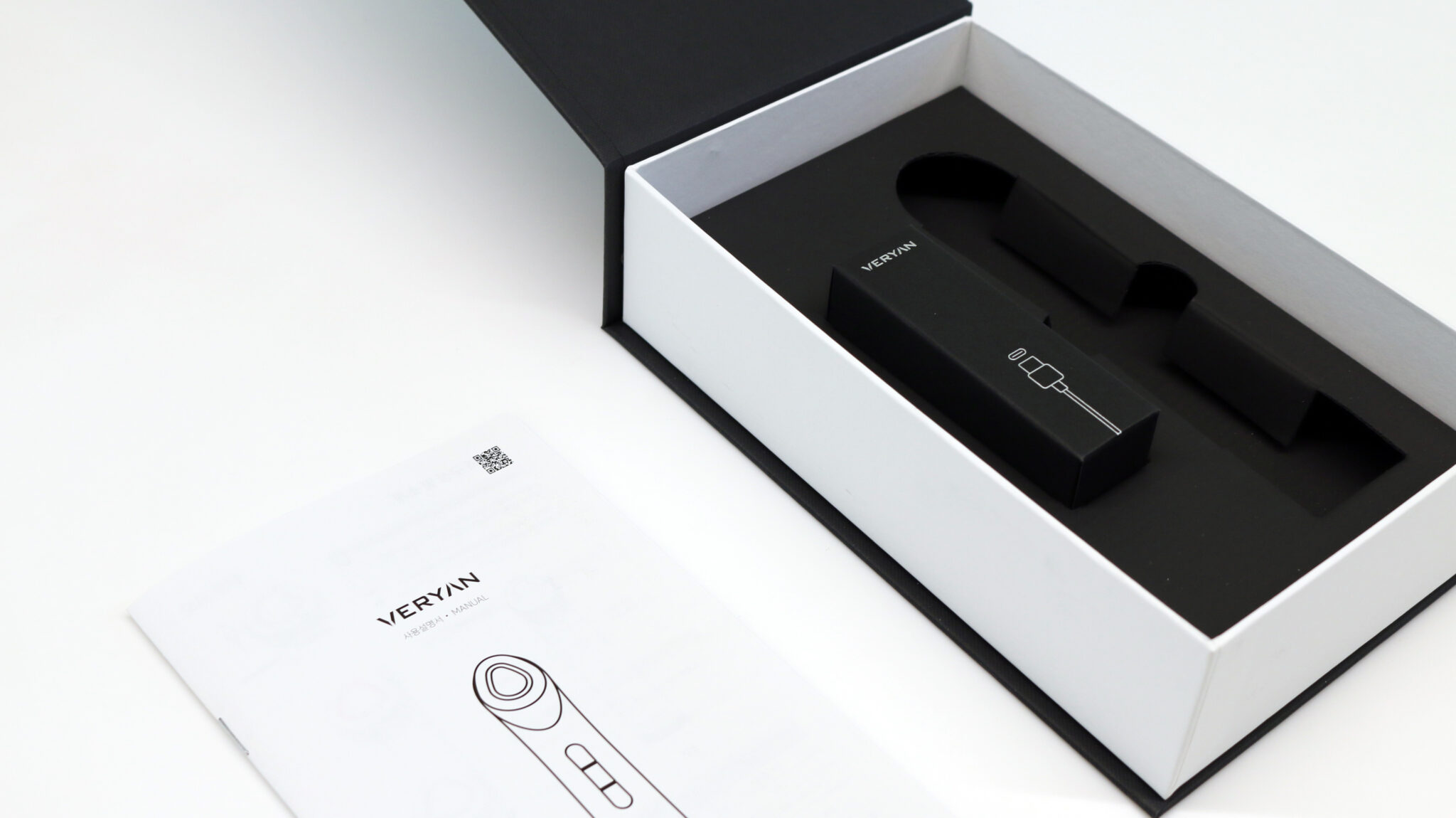
Upon opening the package, the interior reveals a white inner box and black fixing tray structure. The white color, contrasting with the heavy black exterior, eases visual tension during the unboxing moment and clearly highlights the product and its components. The internal tray is designed with a precise layout where the position of each component is clearly defined, allowing users to experience the systematic nature and perfection of the product even before use. The manual also uses a line drawing-centered graphic language, maintaining design consistency across the package, product, and manual to reinforce the impression of organized professionalism.