■ Design Concept
– Neo-Tech Minimalism
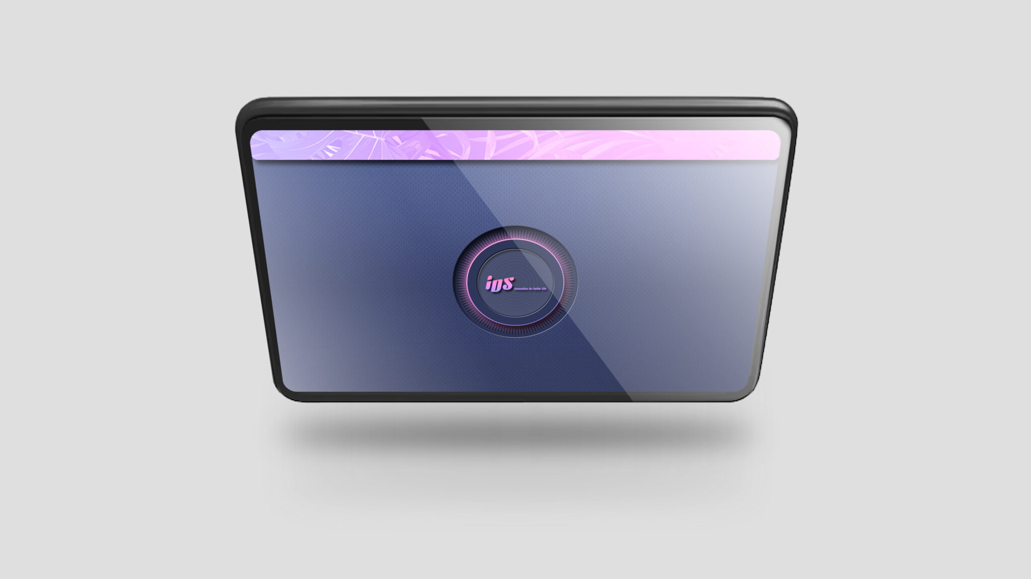
This UI design is a Neo-Tech Minimalism-based interface reinterpreted to allow a visual experience of Pico laser’s high-output and high-precision technology. The overall color system consists of a deep navy base with pink and purple gradients, implementing a Premium Gradient Palette rarely seen in conventional medical UI and completing a unique design language that merges precision technology with an emotional brand experience.
The central circular graphic serves as a core identity visually implying the pulse characteristics of the Pico laser, applied consistently across screens to build strong brand UX coherence. The information layout follows an Intuitive Workflow UI structure aimed at removing unnecessary visual noise, guiding the practitioner through a step-by-step flow from loading to the final check screen without error. Additionally, the use of light-toned text on a high-contrast navy background realizes High-Contrast Readability, ensuring visibility even in dark treatment rooms.
Rounded designs for buttons and panels, along with subtle glow effects, provide a Soft Glow Interaction reminiscent of laser energy diffusion, contributing to softening the rigid image of medical devices and reducing visual fatigue. Consequently, this UI design is defined as a high-end PICO laser UI system created by combining technical precision, modern sensibility, and stable interaction.
