■ Design Concept
–Urban Utility
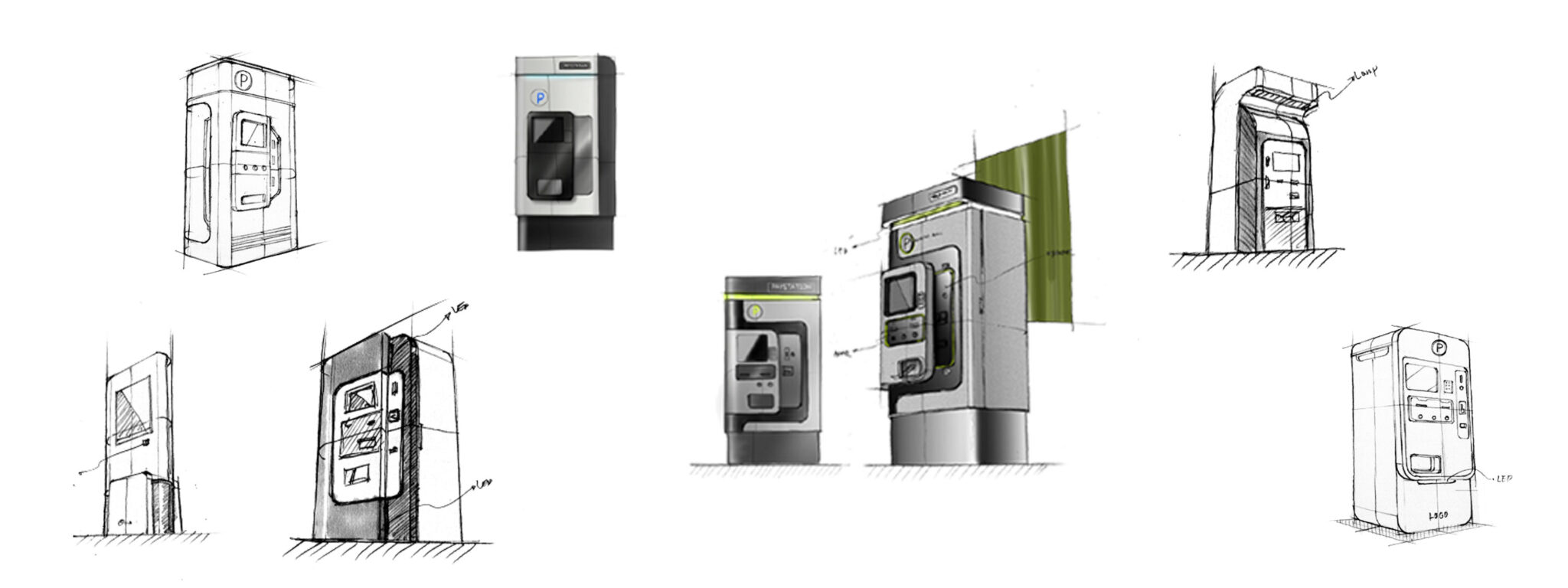
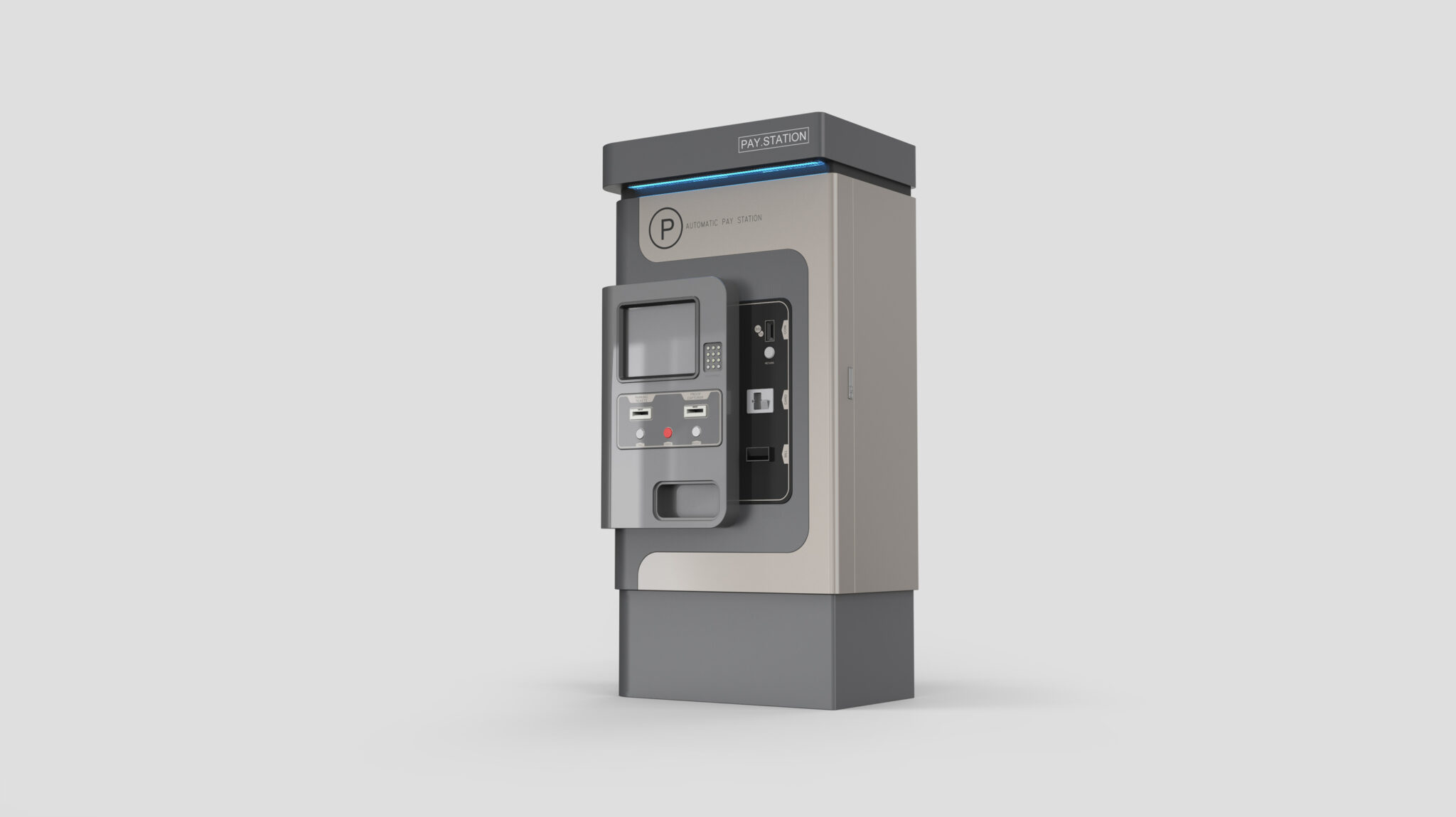
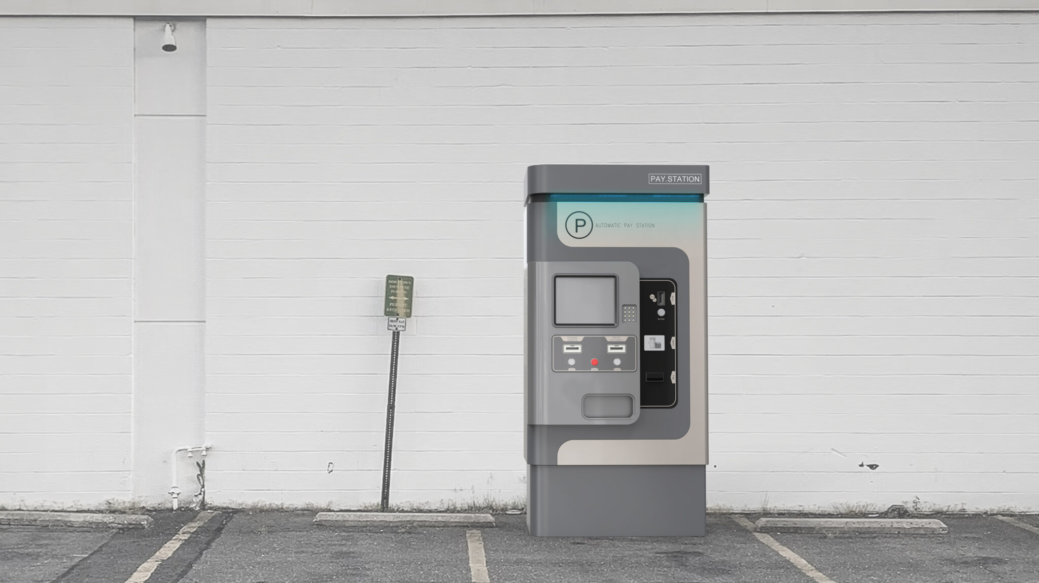
This design aims to be an Urban Utility Device that anyone can use intuitively within a city environment. Considering its long-term outdoor installation, the overall silhouette is built on a Robust Protection Form to ensure strength and stability.
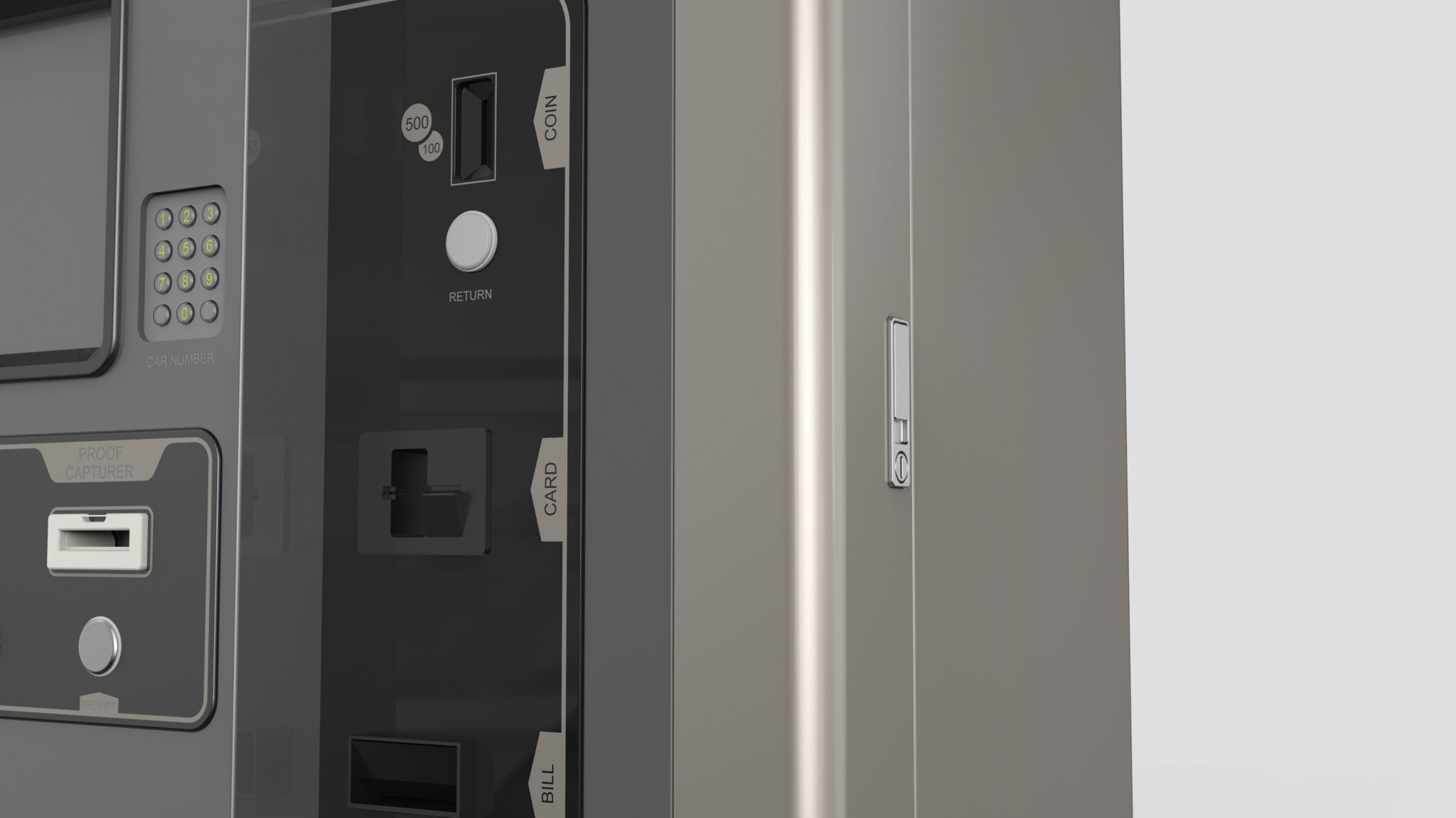
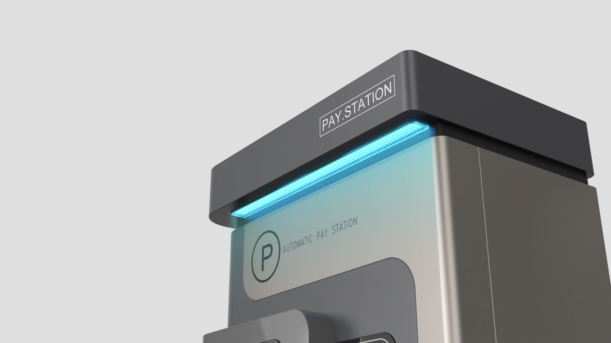
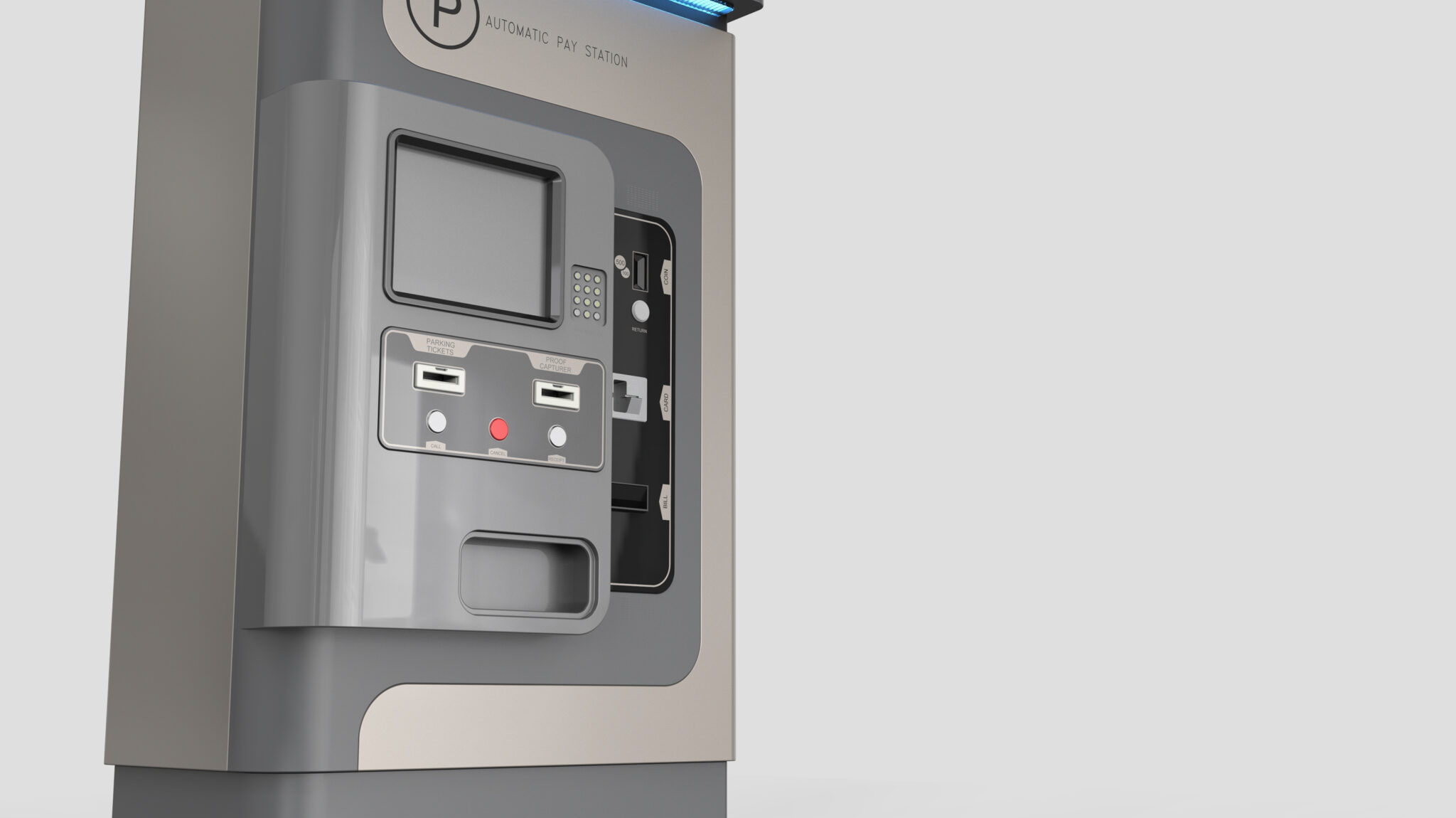
The front interface features a Clear Zoning Structure, separating the screen, card slot, and cash/receipt areas to naturally guide the user’s flow. A key feature is the rounded frame surrounding the payment section, which focuses visual attention while providing physical protection. The Highlight Color Zone (Tiffany Blue) at the top increases visibility as a public utility, making it easy to locate from a distance. The metallic textures and restrained color palette harmonize with the urban landscape, achieving a Function-Centered Minimal Public Design without excessive ornamentation.
Overall, this product reflects a design direction of a Durability-Centered Smart Payment System that possesses both user-friendliness and adaptability to the urban environment.