■ Design Concept
– Dynamic Diagonal Graphic
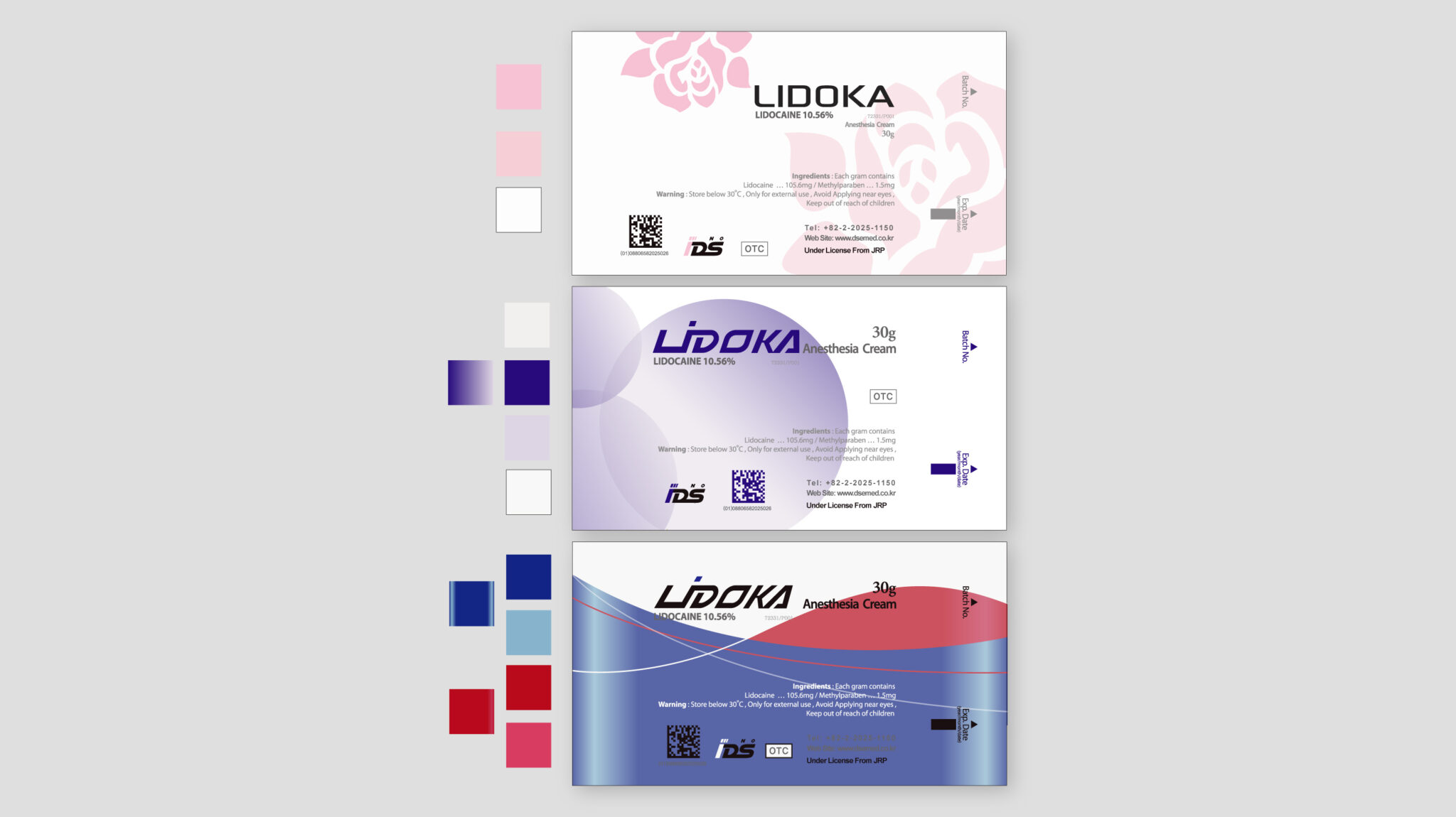
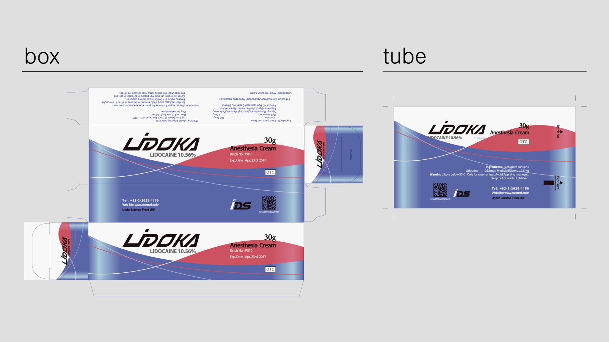
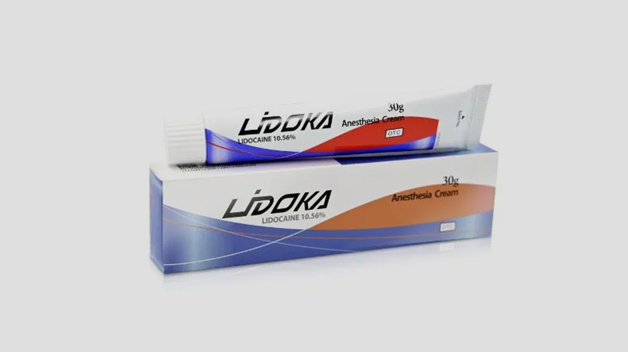
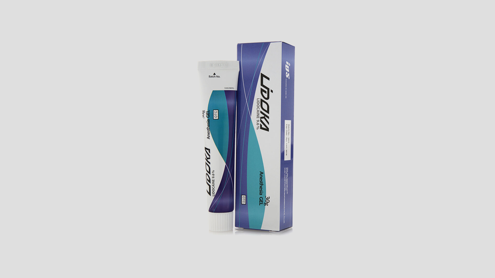
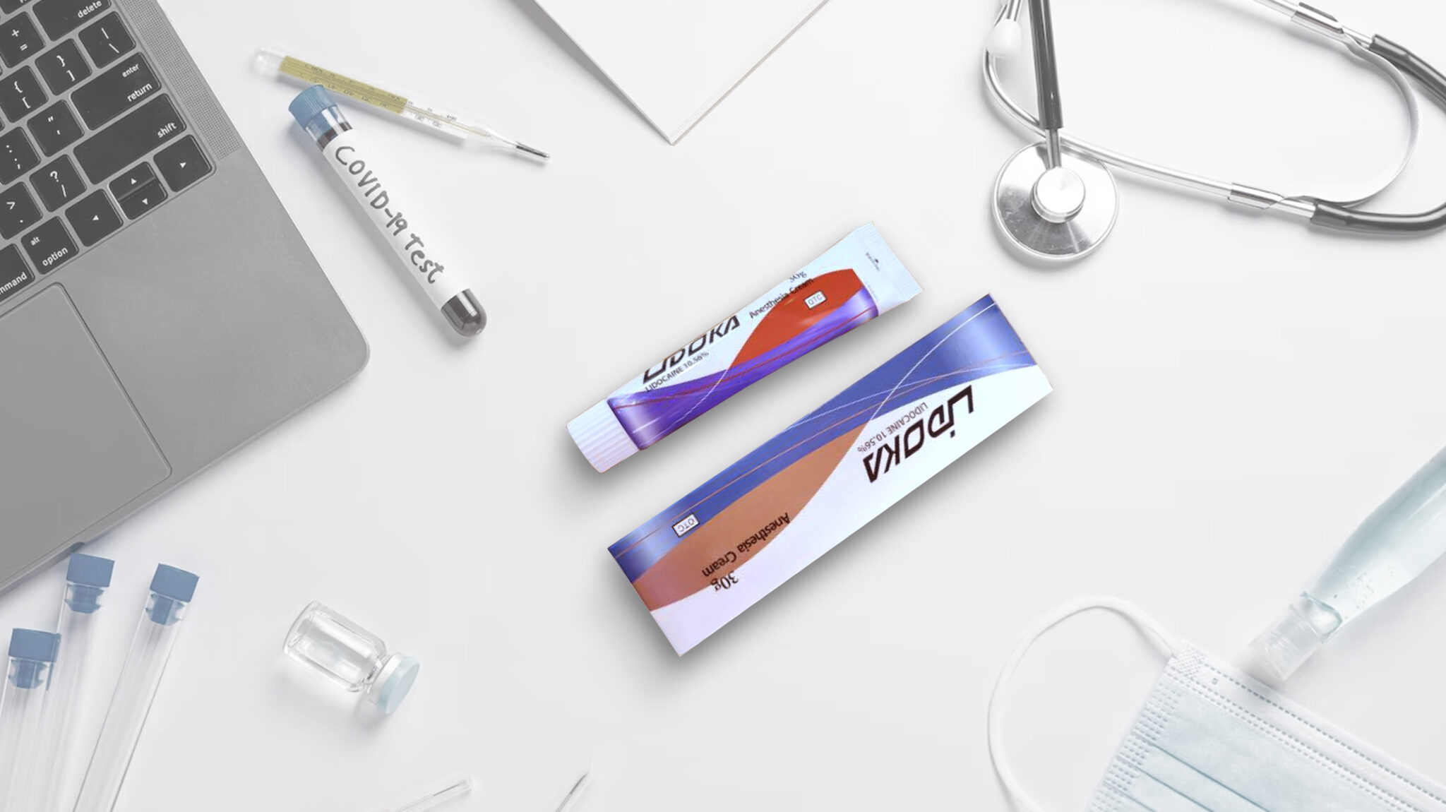
The LIDOKA package design sets Clinical Trust and Professionalism as its core values, delivering a clear medical identity through a clean and modern approach. The layout centers on Sterile Medical White to visually emphasize cleanliness, safety, and hygiene.
A Dynamic Diagonal Graphic Structure is applied over this base, lending technical energy and a modern sensibility to the pharmaceutical packaging. Colors such as orange and blue function as a Color Coding System for Intuitive Classification, helping medical staff quickly identify and select products. The product name, LIDOKA, is placed using high-contrast typography to enhance Rapid Information Accessibility and Professionalism while serving as a key branding element.
The graphics on the tube and outer box maintain a consistent visual language to build a Unified Brand Identity. Reflecting the clinical context, the design achieves Functional Simplicity by excluding excessive decoration. Ultimately, this work completes a premium pharmaceutical package design that integrates Safety, Professionalism, and Modern Technical Prowess.