■ Design Concept
– Calming Medical Palette
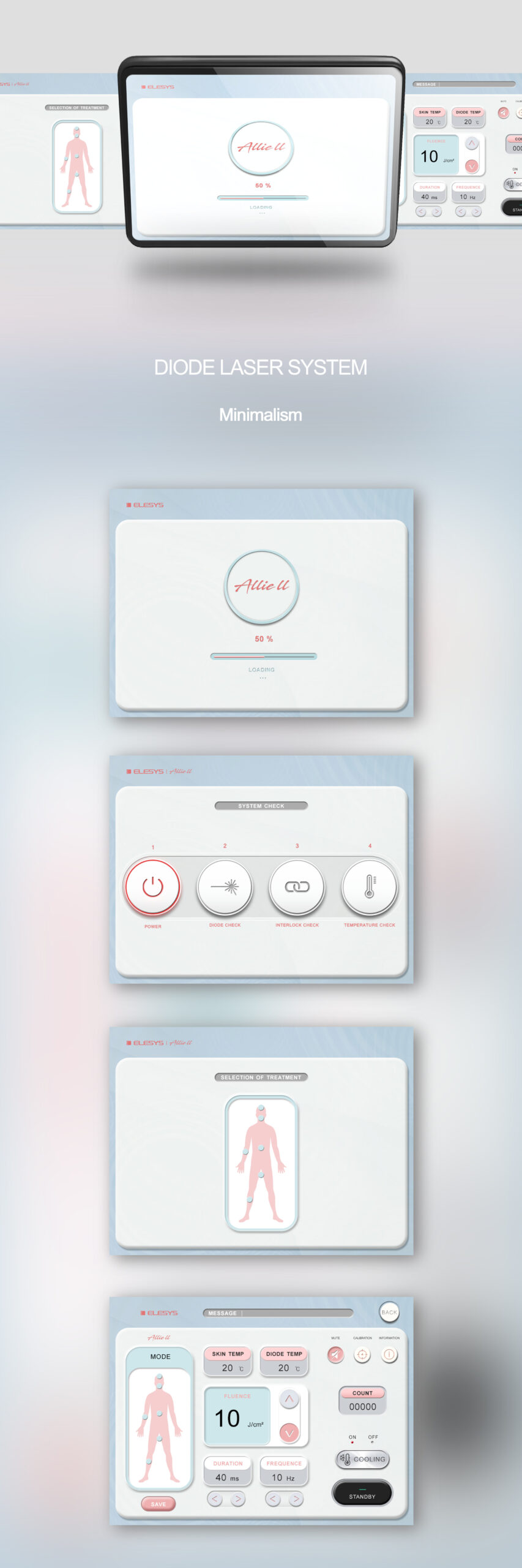
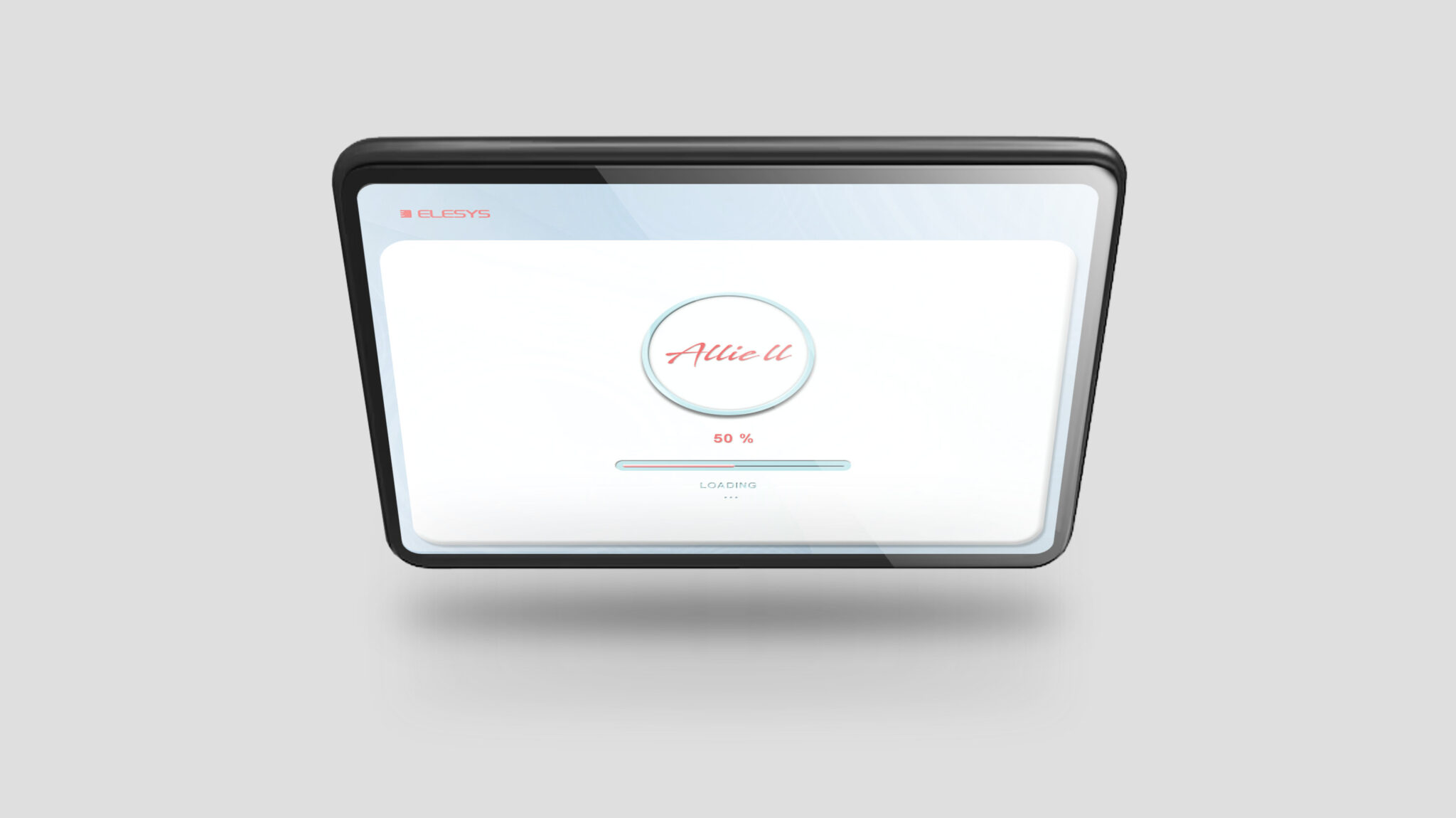
This design is based on Soft Minimalism, reinterpreting the complex information and control functions of medical diode laser equipment into an intuitive, minimal interface. The screen layout secures wide negative space to minimize visual burden and employs a Visual Hierarchy strategy that densely presents only the core information required for immediate focus.
The color system utilizes a combination of pastel blue, pink, and white to create a Calming Medical Tone that provides psychological stability. This offers a steady environment for the practitioner while helping to lower user tension. Each button and element features softly rounded corners, embodying a continuous and warm Soft-Tech Aesthetics. The sequential screen configuration, ranging from system checks to part selection and settings, follows a Sequential UX Flow optimized for medical processes, ensuring users never encounter confusion.
The treatment area selection screen uses simple human body illustrations and pink accents to enable fast decision-making, while the parameter setting screen clearly separates numbers and units to minimize the possibility of malfunction and increase operational clarity. Ultimately, this UI is completed under the concept of a user-centered medical interface that redefines complex functions through a simple, emotional, and minimal design.