■ Design Concept
–Eurotic Metallic Aesthetic
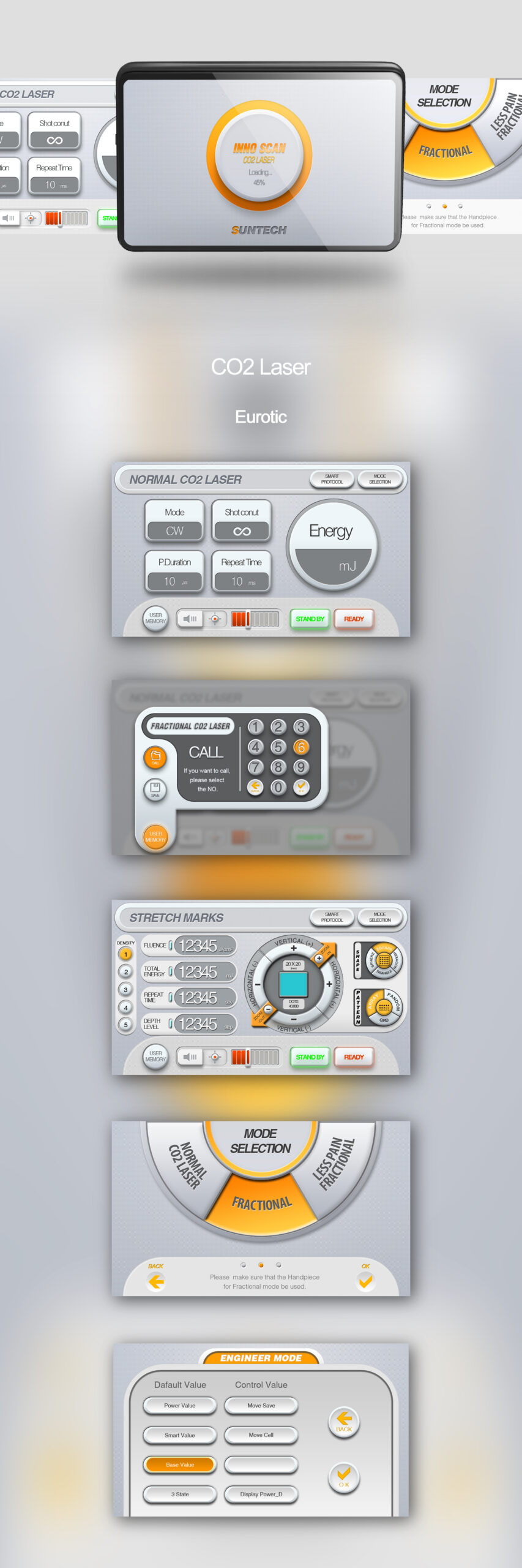
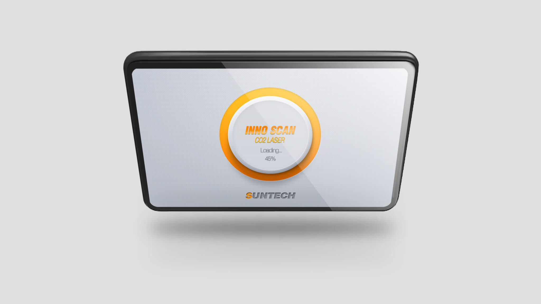
The core philosophy is a High-Tech Medical Interface with a Eurotic Sensibility. The combination of metallic textures, similar gradients, and restrained gray tones communicates the professionalism, cold precision, and stable reliability characteristic of medical equipment UIs.
The UI structure is organized into a Clear Information Hierarchy (Mode Classification → Numerical Input → Execution Status), allowing users to rapidly recognize treatment modes and energy settings. The central circular UI reflects the performance image of CO2 laser equipment, acting as a Core Element that Visually Expresses Mechanical and Precision Operational Feelings, similar to an engineering device.
Each button is designed with a Rounded 3D Volumetric Form to provide visual tactile stability, while color contrast allows for the intuitive distinction of states such as “Available,” “Caution,” and “Ready for Treatment.” In particular, the Orange Point Color highlights core functions and builds brand identity consistency, naturally guiding the user’s gaze. Ultimately, this design is a UI system that secures Medical Device Reliability, Intuitive Usability, and Brand Identity, achieving stable, engineered, and aesthetic perfection suitable for the high-end medical equipment market.