■ Design Concept
– Graceful Precision
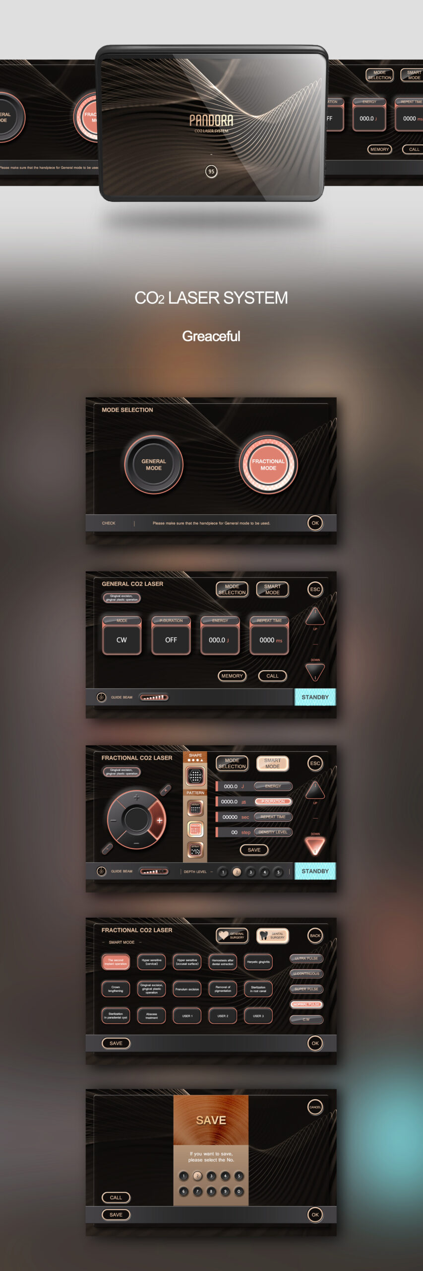
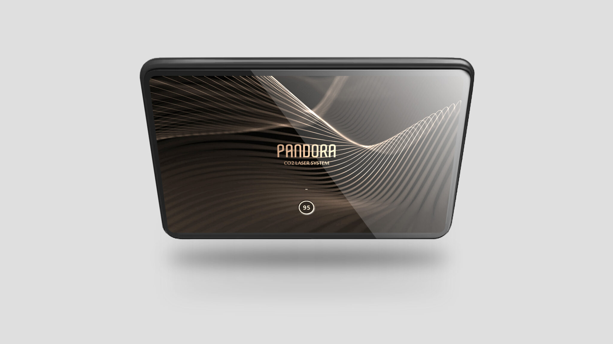
Visual Identity of the CO₂ Laser Interface — A harmony of elegance and precision
The interface of this CO₂ laser system visually combines two core values: Graceful and Precision. The three-dimensional wave pattern flowing across the screen uses laser wavelengths as a metaphor, symbolizing both technical reliability and brand identity. By adding a subtle glossy layer over a dark-tone background, the interface is designed to make the device appear as a premium object.
The buttons and modular UI elements use copper and gold-toned metallic color points to enhance the premium feel, establishing a visual hierarchy that naturally guides the user’s eye to key controls. Circular dials, soft neon edges, and gradual brightness changes ensure intuitive operability and stable usability in actual medical environments.
Each mode features distinct contrast and a color signature, centered on the efficiency of quick judgment, clear confirmation, and repetitive tasks required during medical procedures. The overall UI flow organizes complex settings into a simple yet profound structure, allowing for the detailed customization experts desire while reducing user fatigue.
Ultimately, this design goes beyond a simple interface to complete a new visual identity for high-end CO₂ laser systems, merging the accuracy of medical technology with brand sensibility and practitioner-centered functional UX.