■ Design Concept
– Minimal Utility with Soft Emotional Safety
This design interprets the core purpose of Smartphone Addiction Prevention and Safe Calling through three pillars: Simple, Safe, and Emotional Ease.
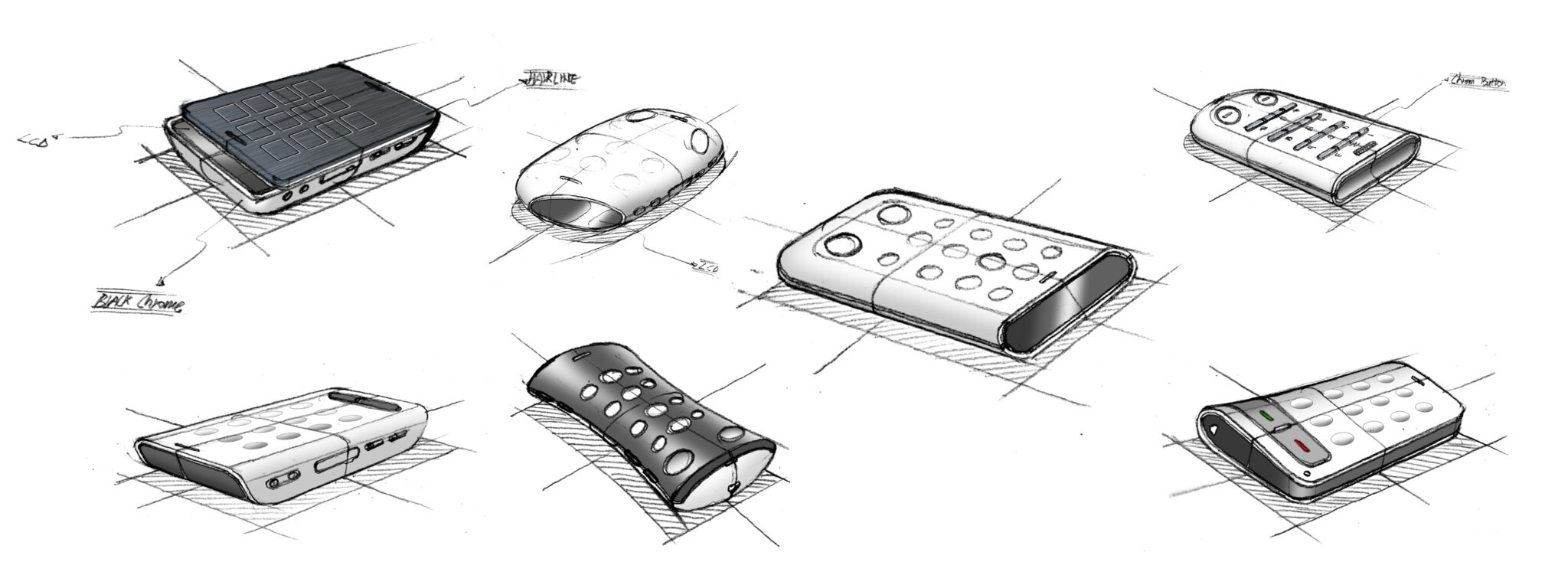
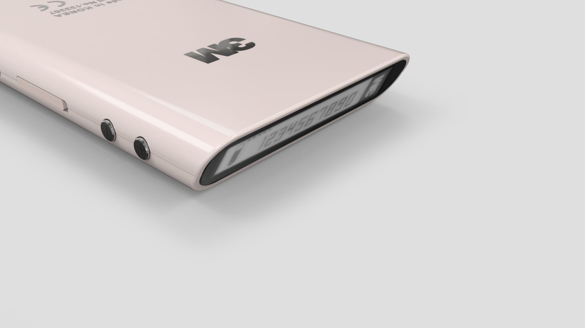
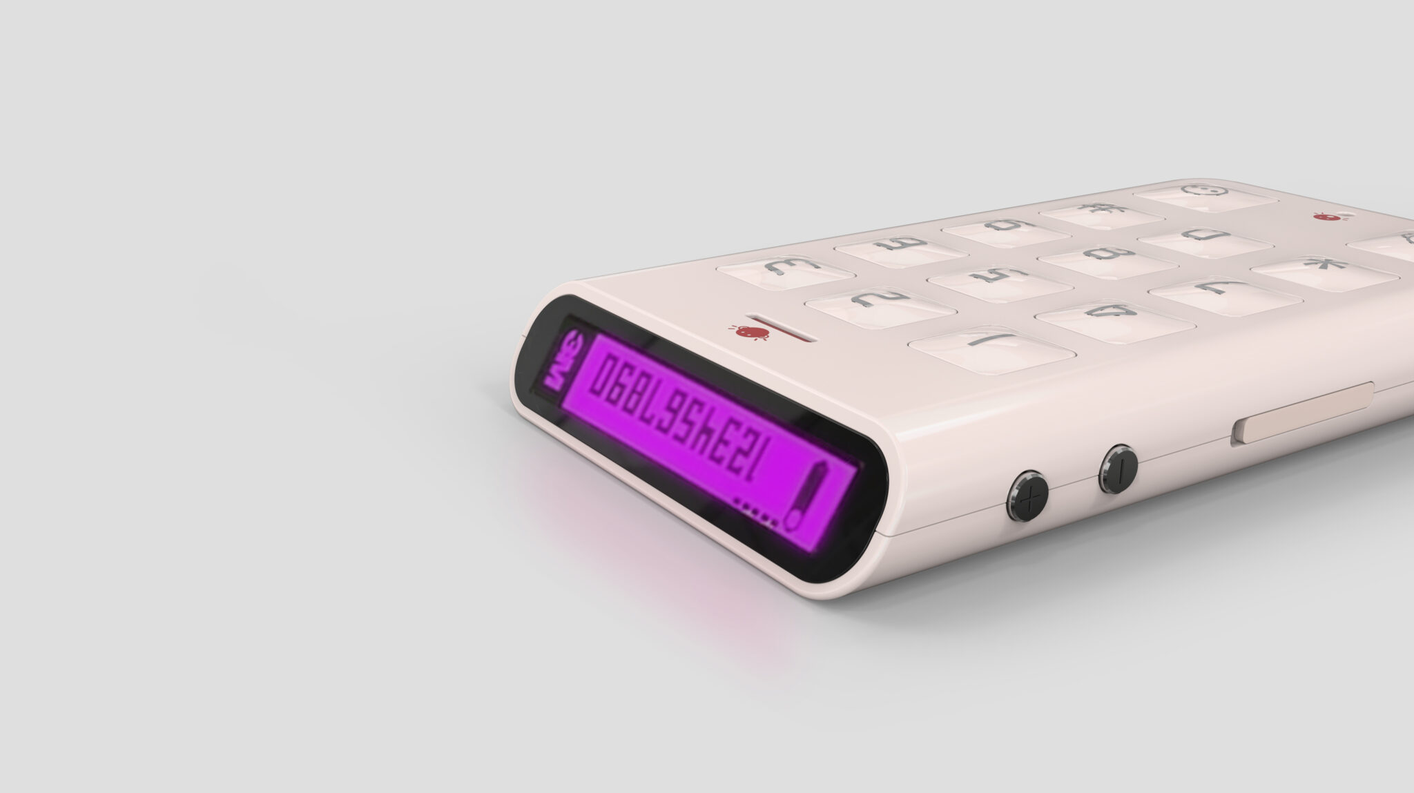
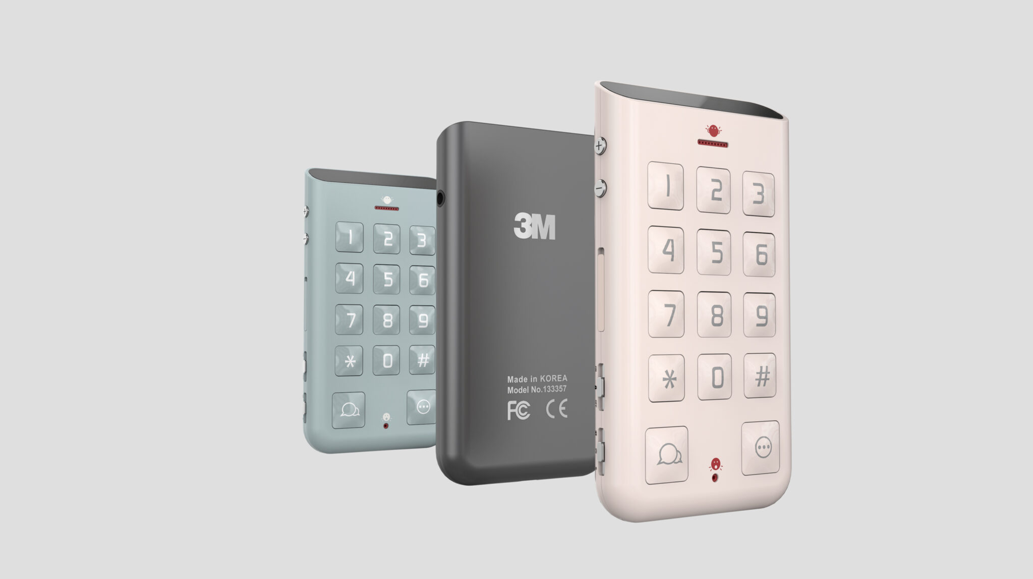
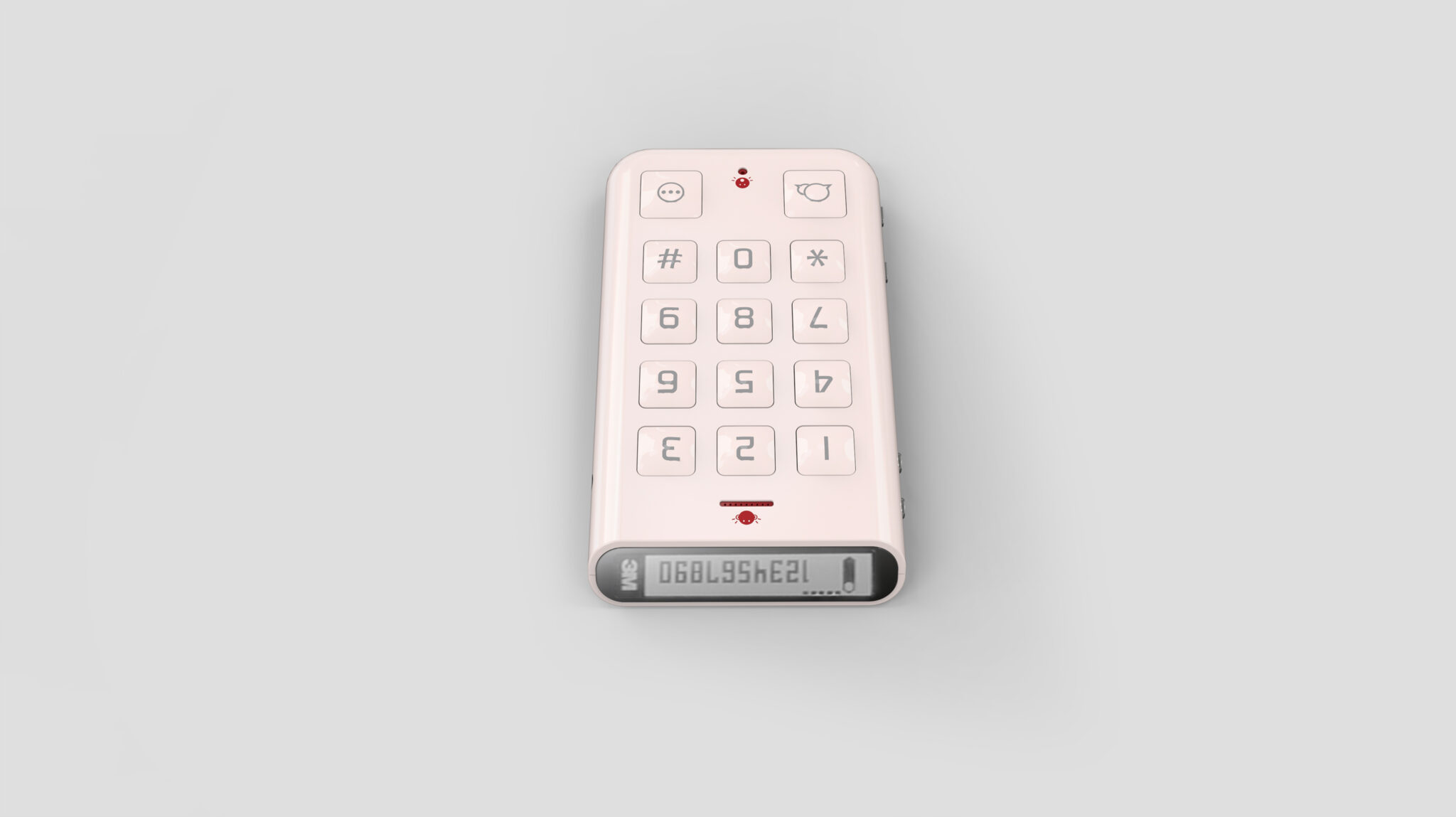
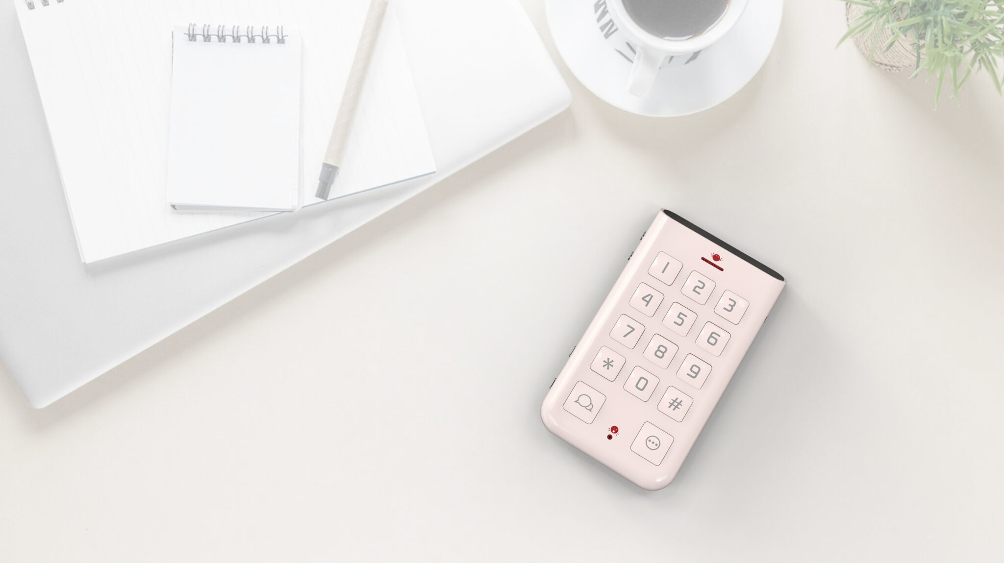
The key is a UX Structure Retaining Only the Most Basic Communication Functions, which is reflected in both its form and color. Rounded edges and soft volumes maximize stability in the hand, while a large rubber-dome keypad provides Clear Feedback and Operability.
The color palette, featuring pastel tones (Mint, Sand Pink) and matte black, is friendly to a wide age range and minimizes the image of a psychologically Immersive Digital Device. The simple front LED display and the mechanical feel of the side hard keys visually complete the product’s philosophy: Only as much as needed, with absolute clarity.